Essentially, a vlootkit™ serves as a comprehensive toolkit tailored for managing the fleet. The term vloot pronounced as [flot] was chosen from Dutch, which is translated as fleet while kit remained in English. This naming decision was made to infuse some European essence into the product, aligning it with the intended market positioning for vlootkit™ within Europe.
Naming


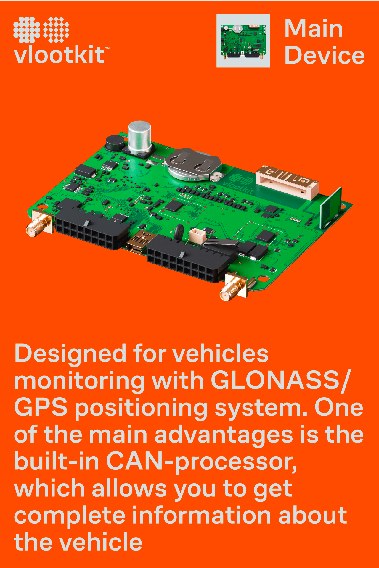
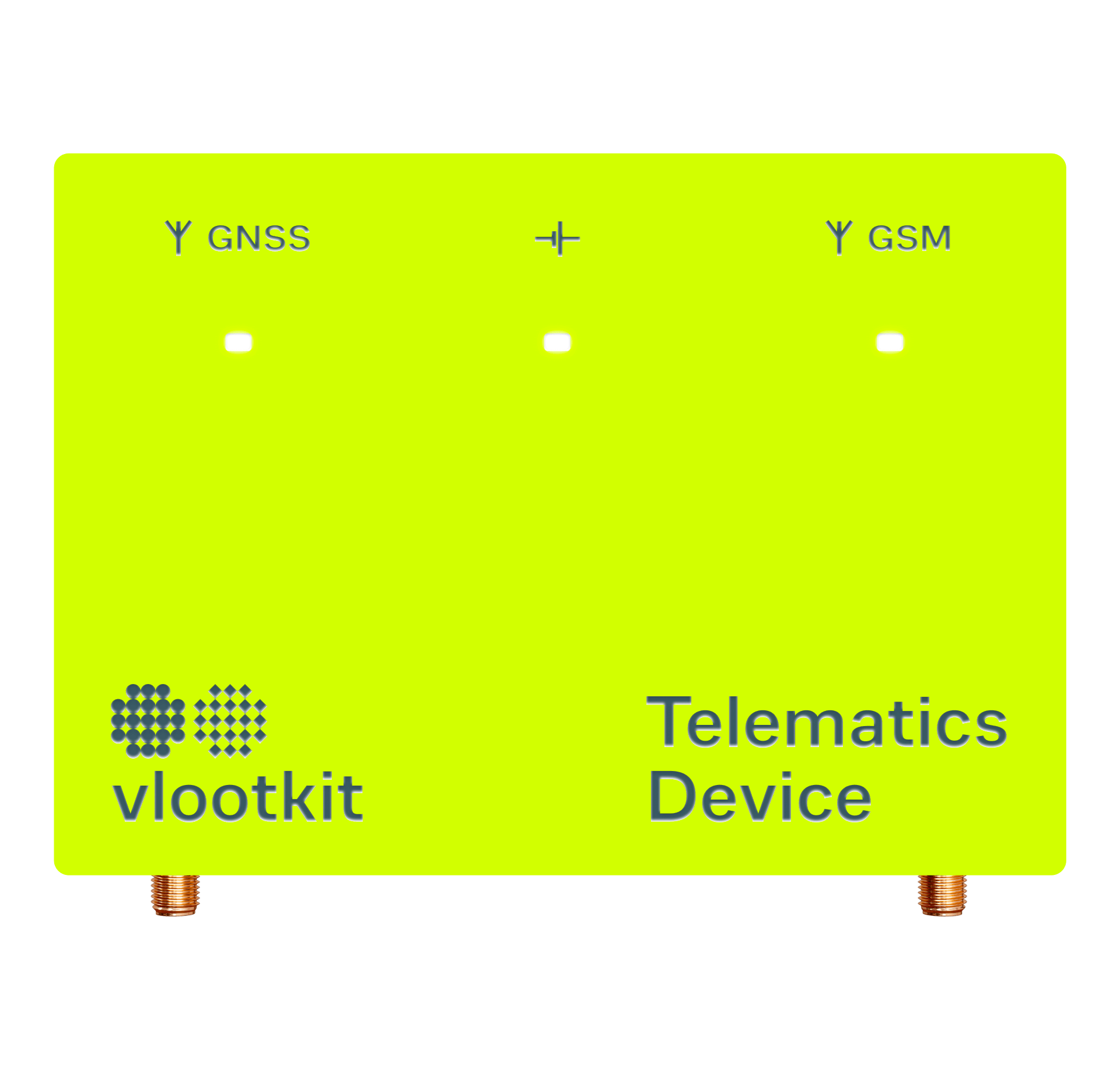
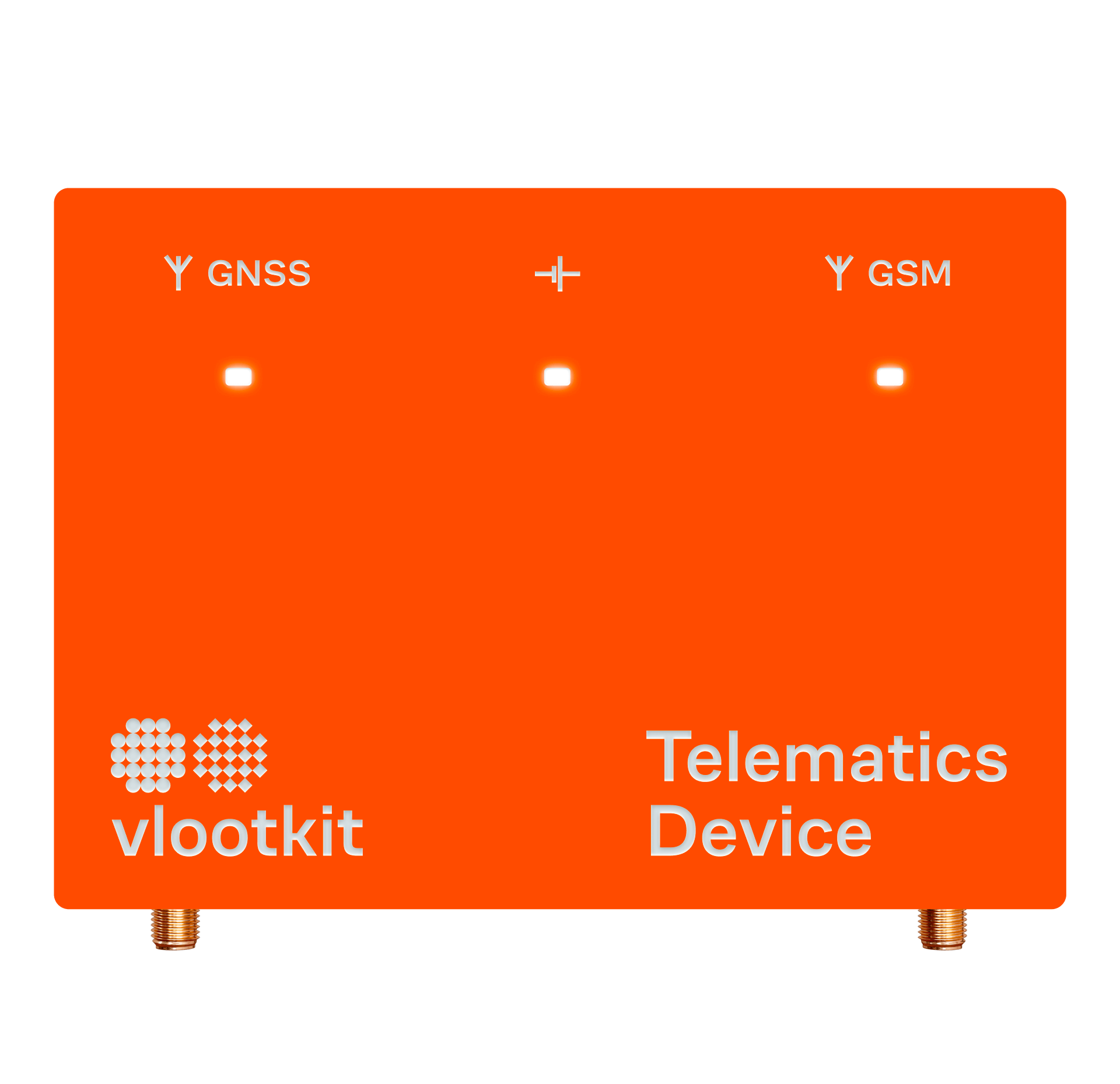
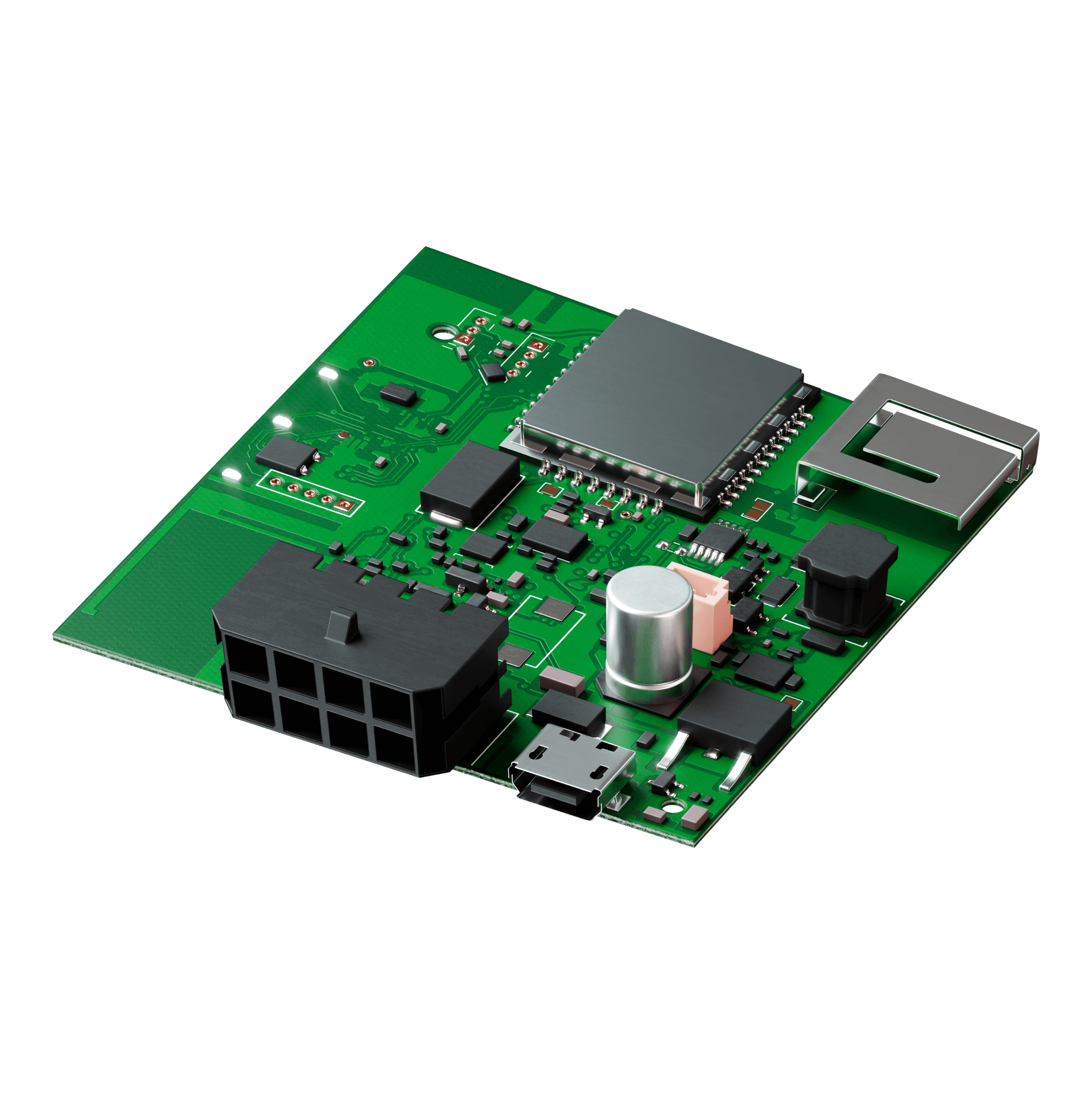
Since there is a Dutch word in the name, the main accent color during the palette was orange and a complimentary green color was selected to it, which rhymes with the green color of the board and speaks about the technological, hardwired origins of the product.
The atomic apple color is paired with orange and supports the image of something very modern.
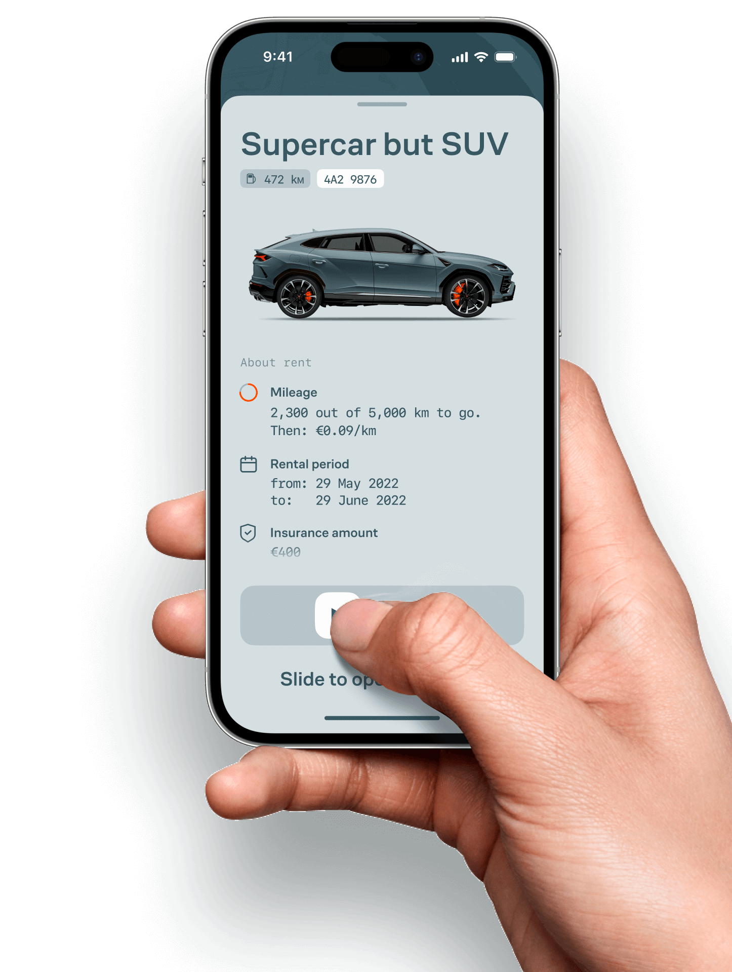
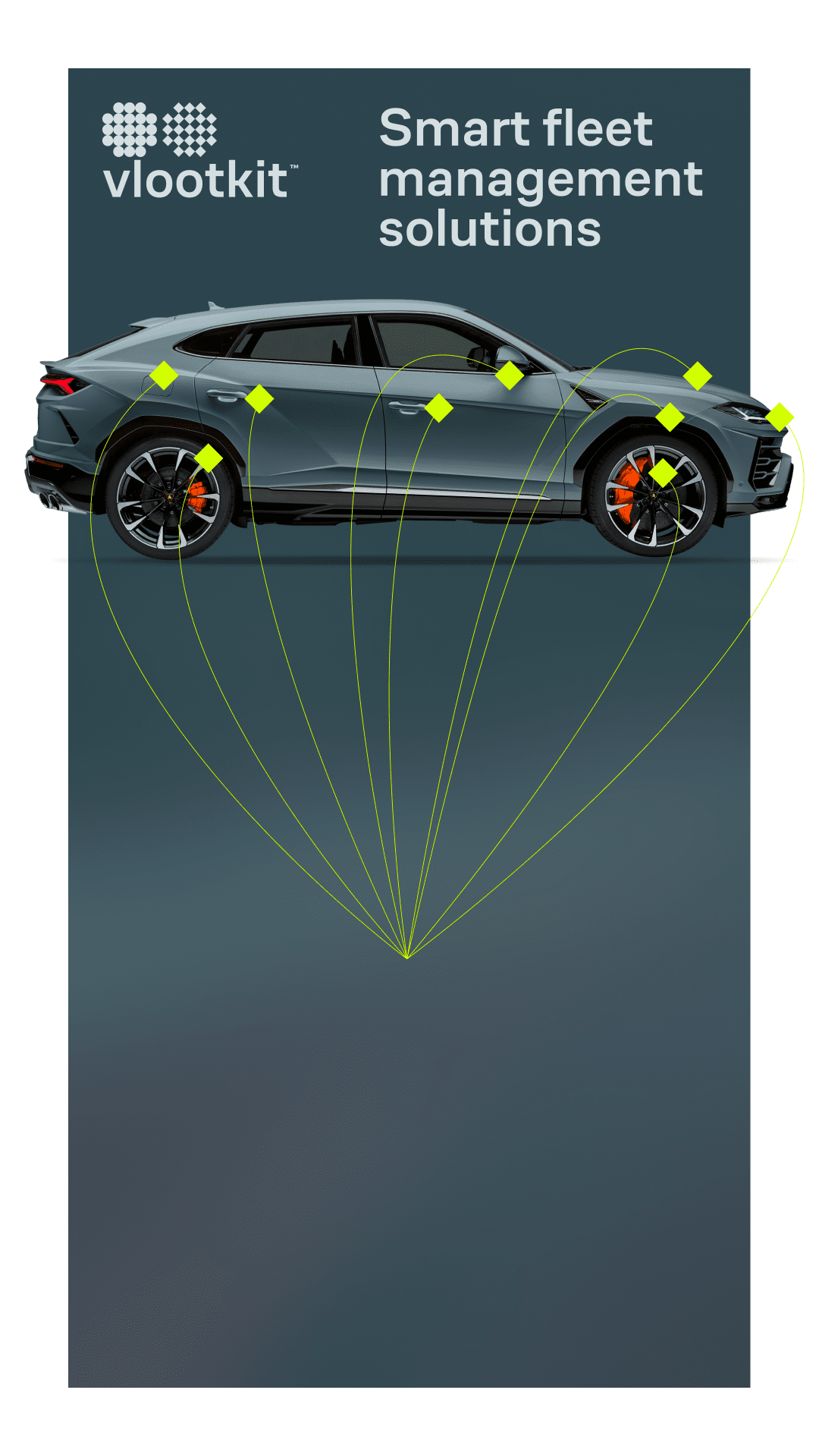
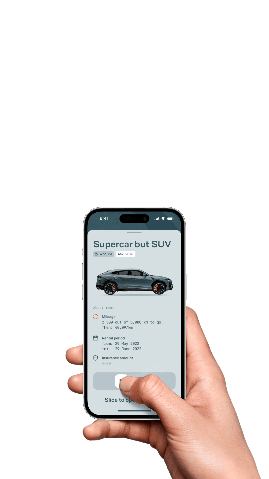
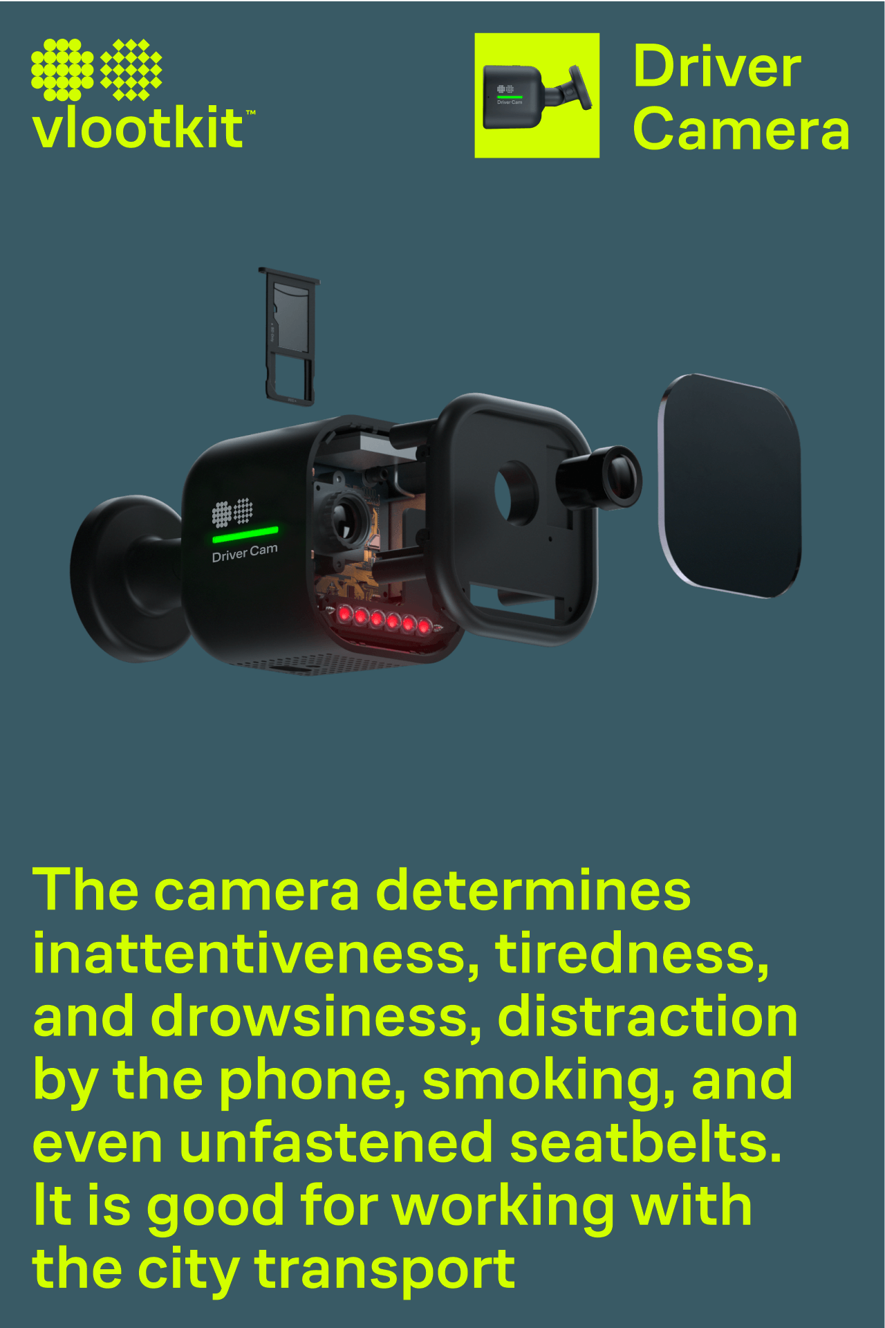
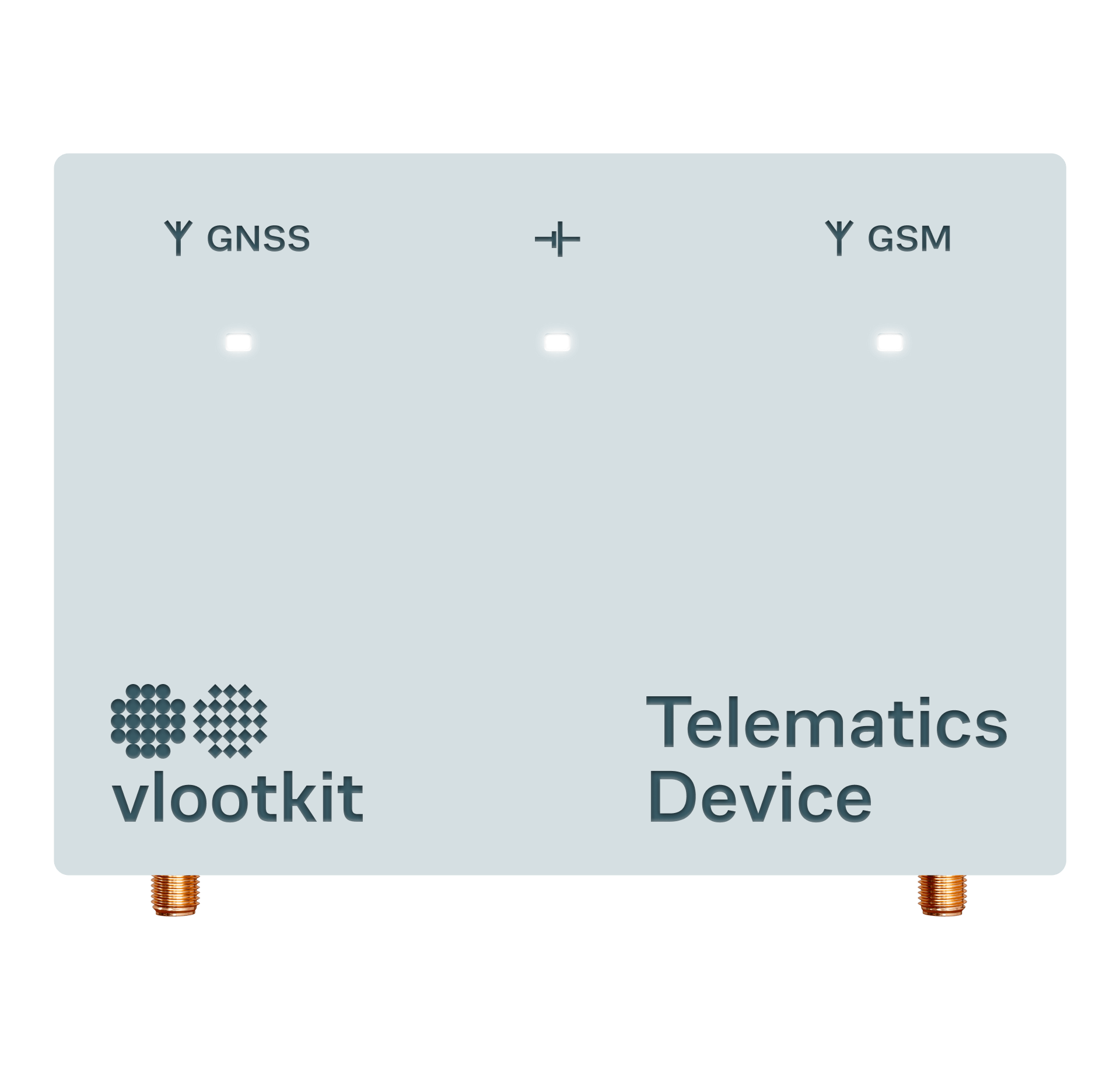
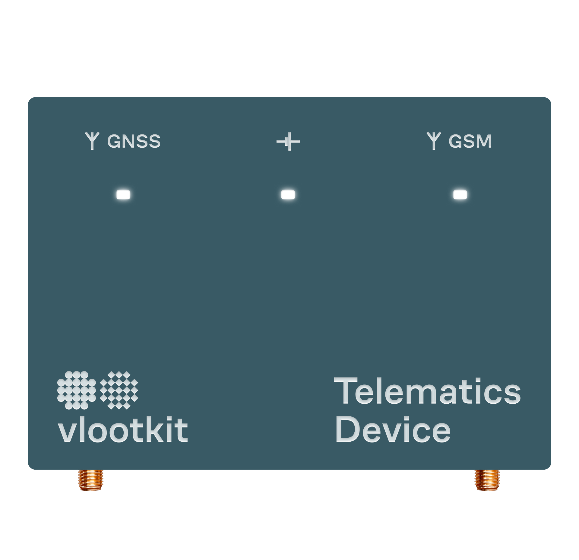
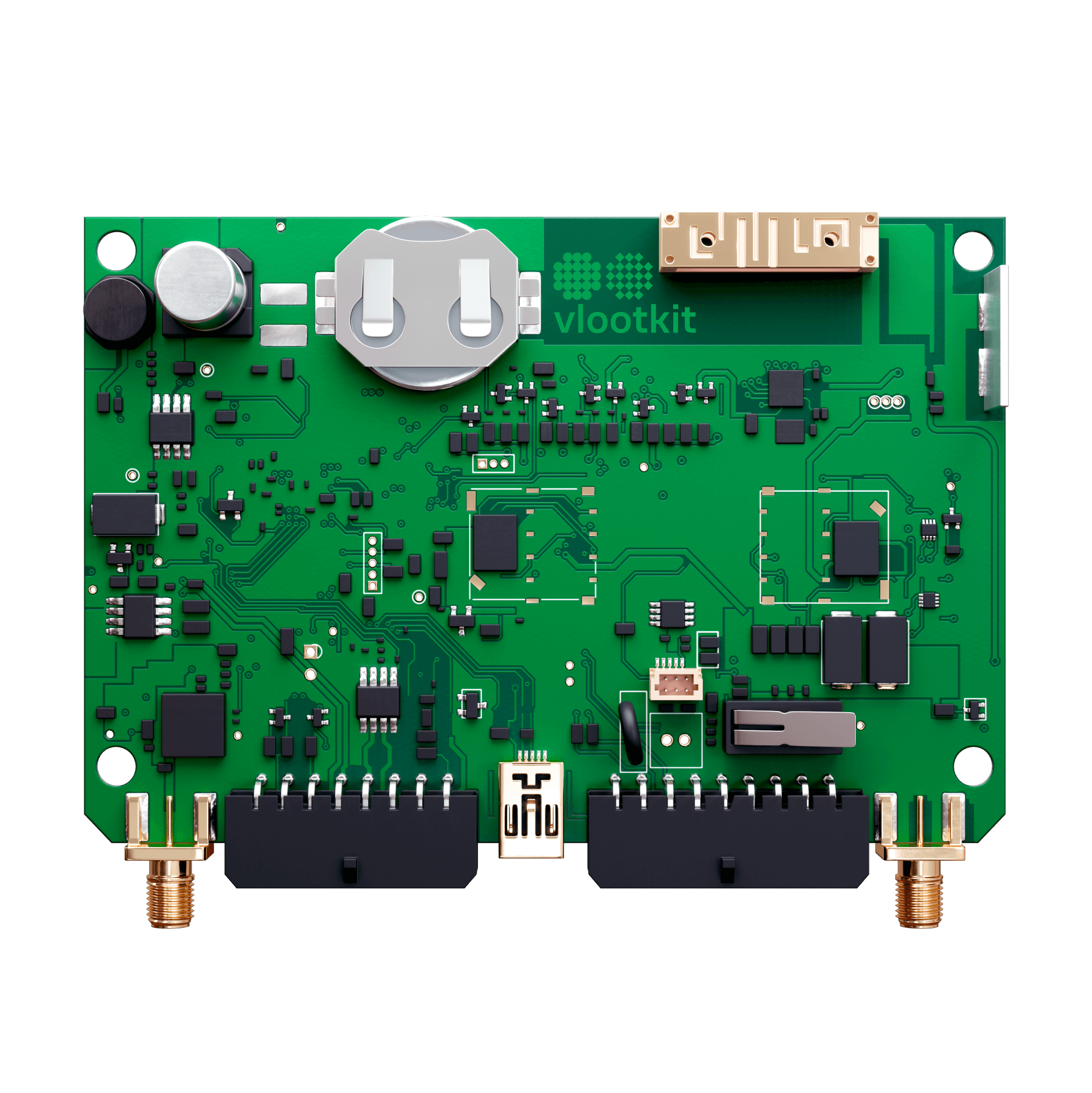
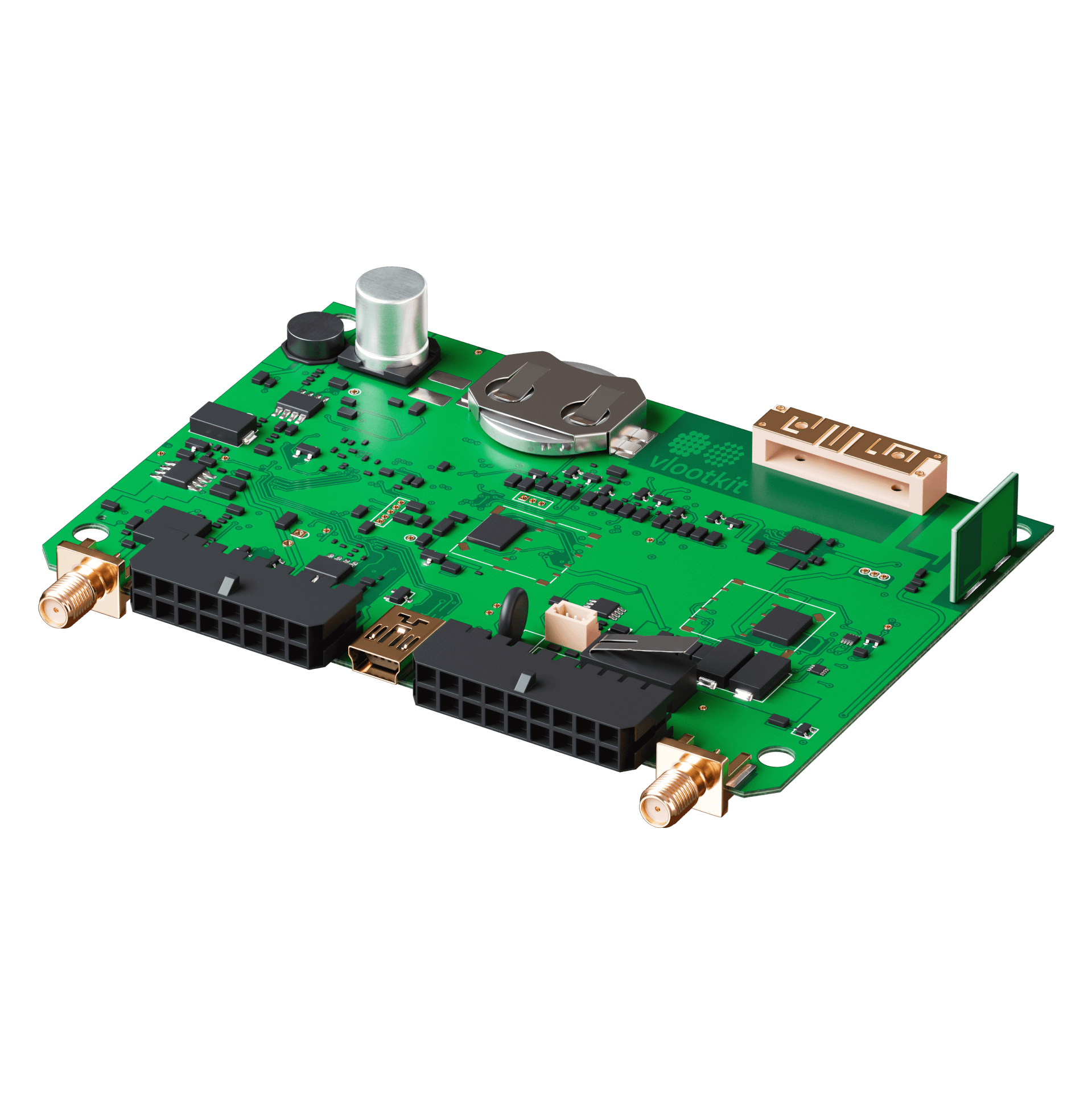
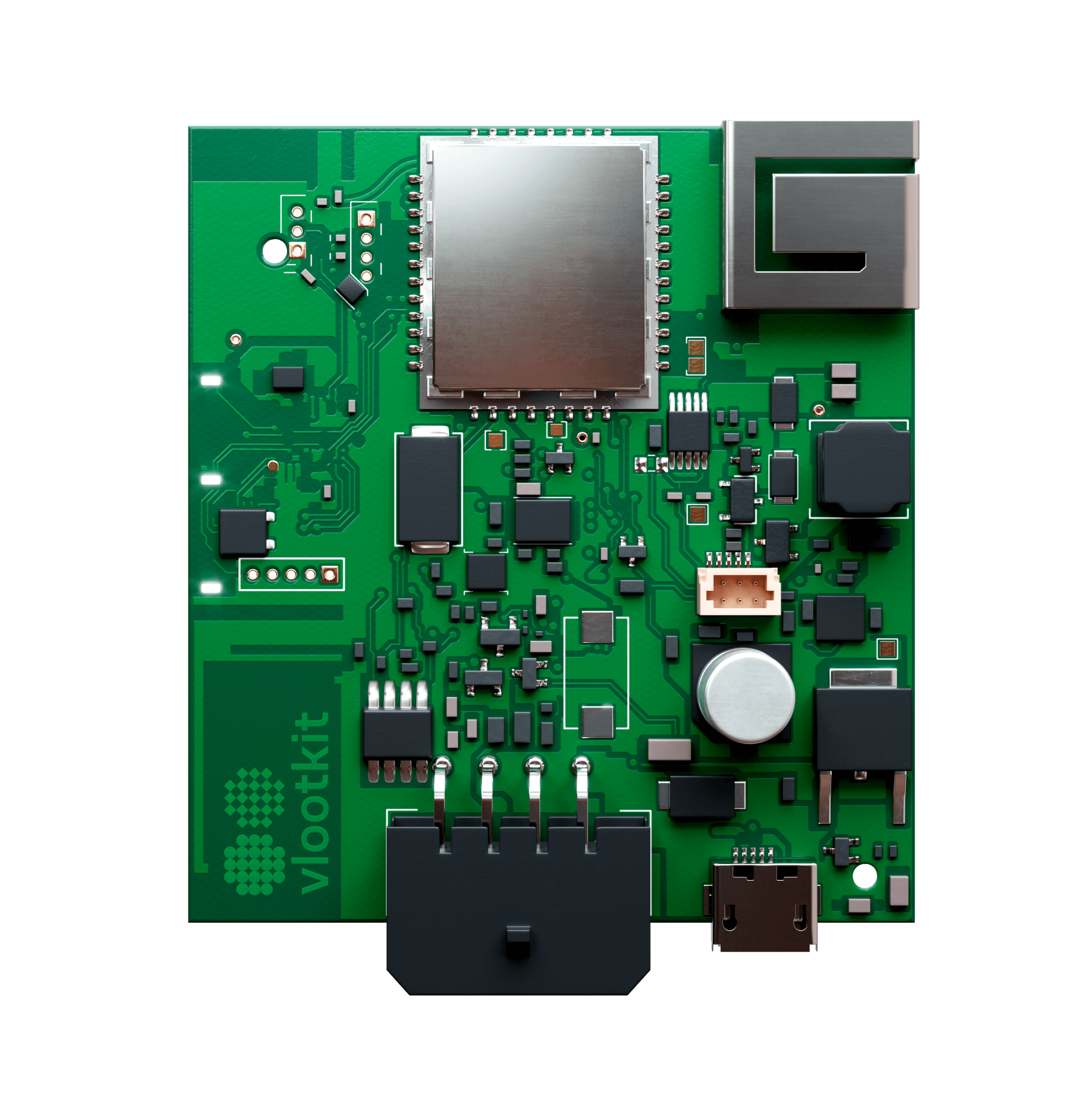
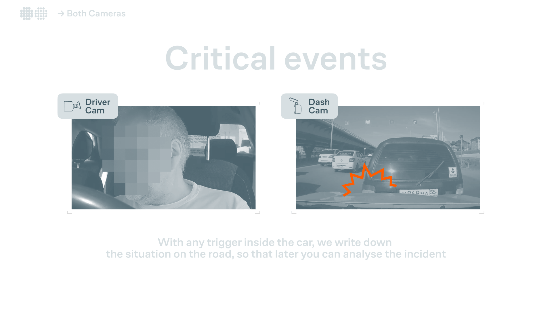
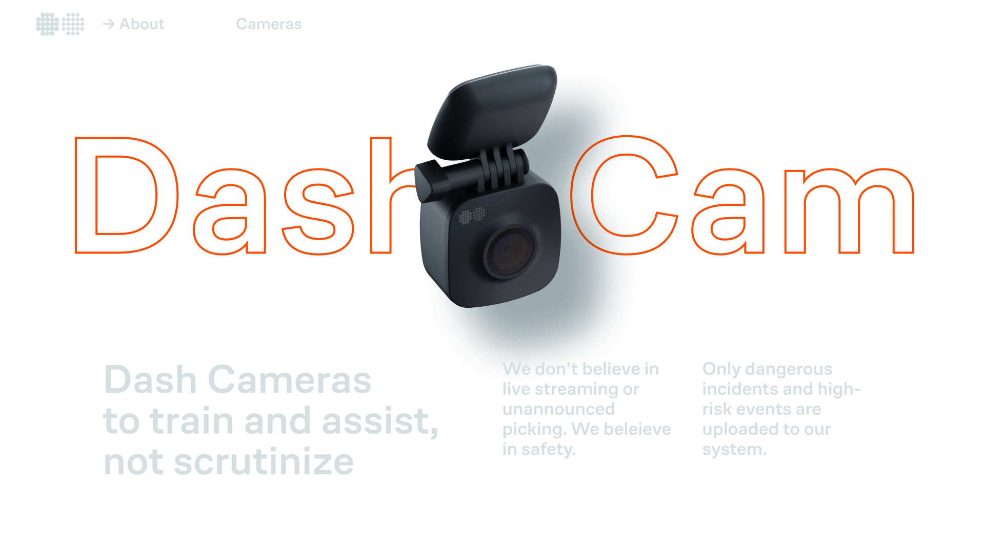
Mainly the overall communication was focused on creating presentations for meetings with potential customers, however, I also took part in designing the box for the main device, the vlootkit™ IOT mk.
The atomic apple color is paired with orange and supports the image of something very modern.
Mainly the overall communication was focused on creating presentations for meetings with potential customers, however, I also took part in designing the box for the main device, the vlootkit™ IOT mk.
Design








Nikita Borodin™. 2025

©
