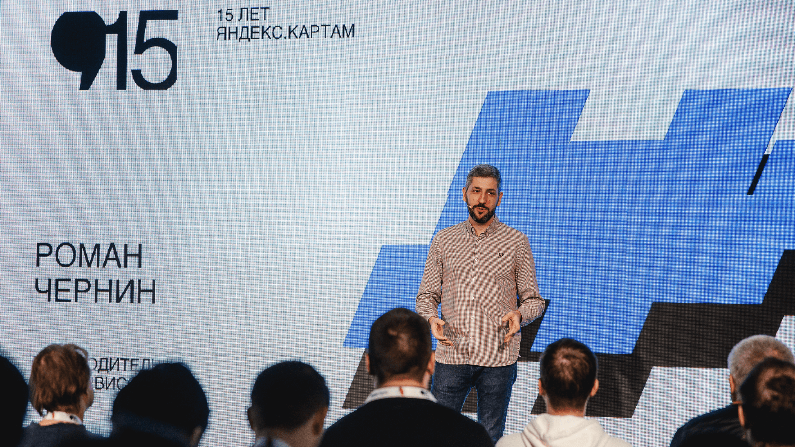

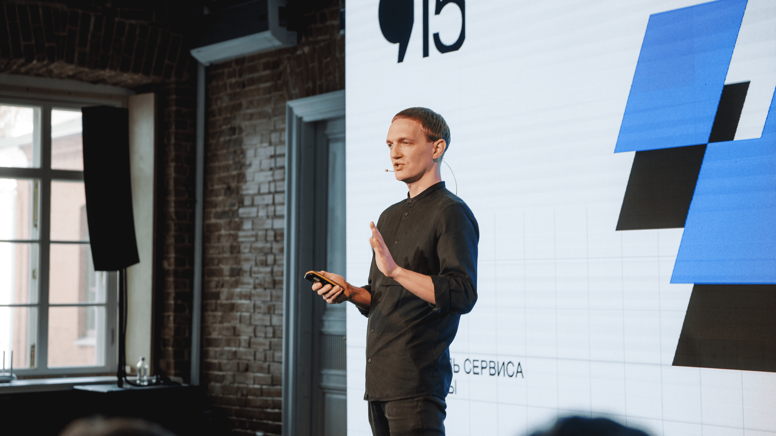
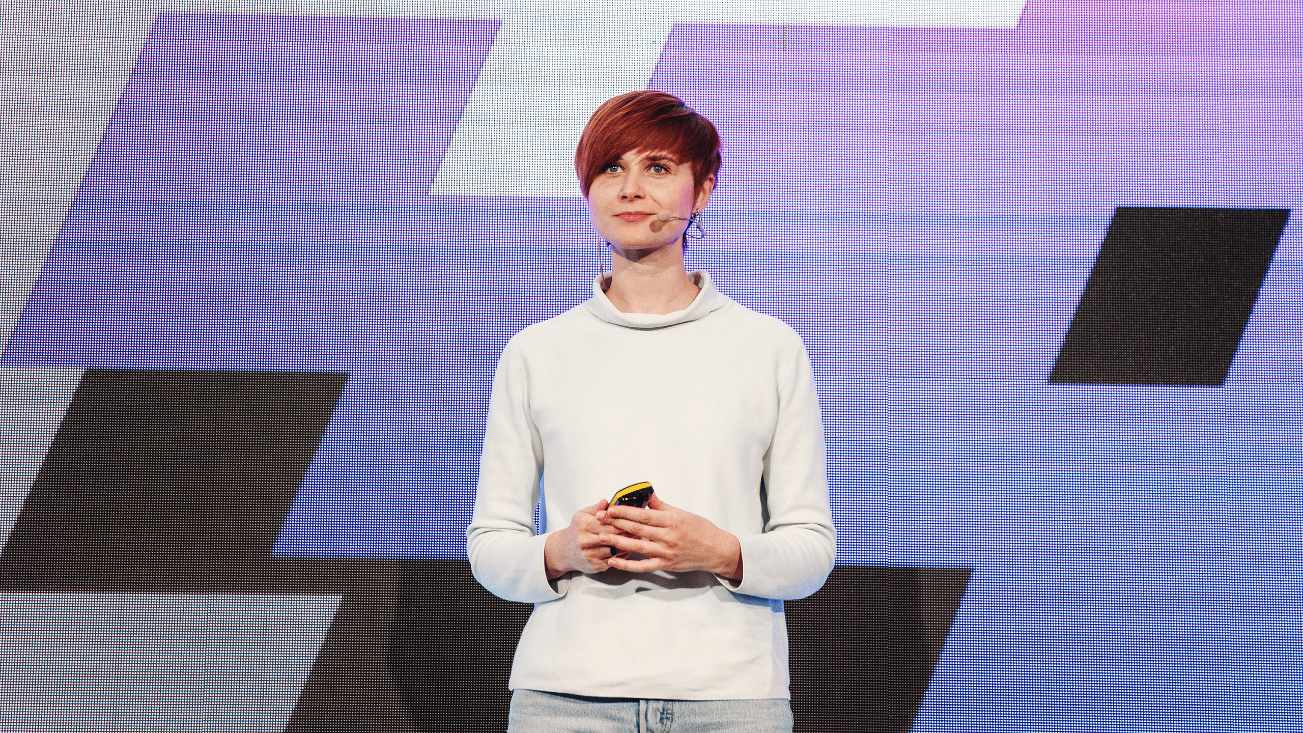
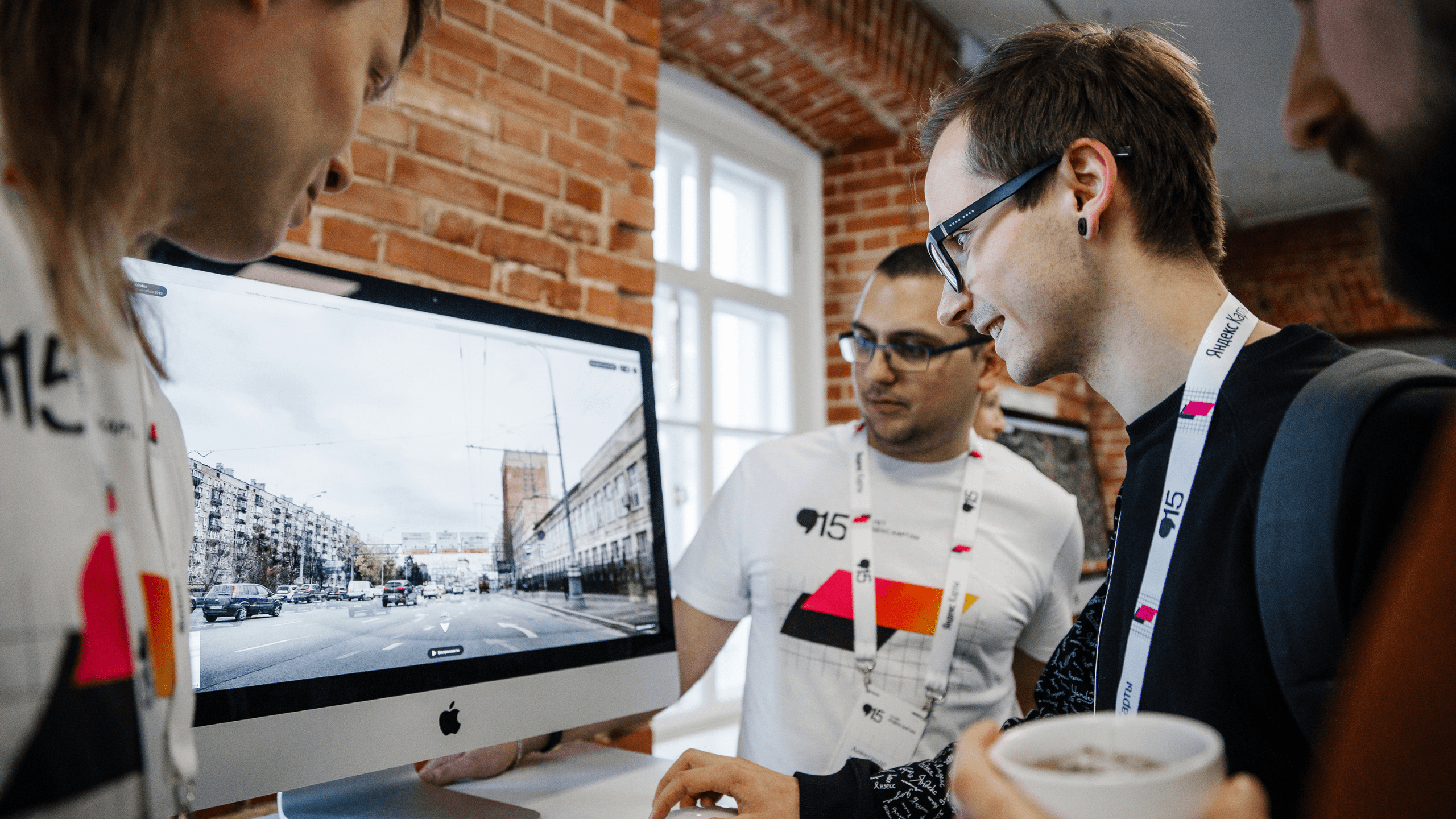
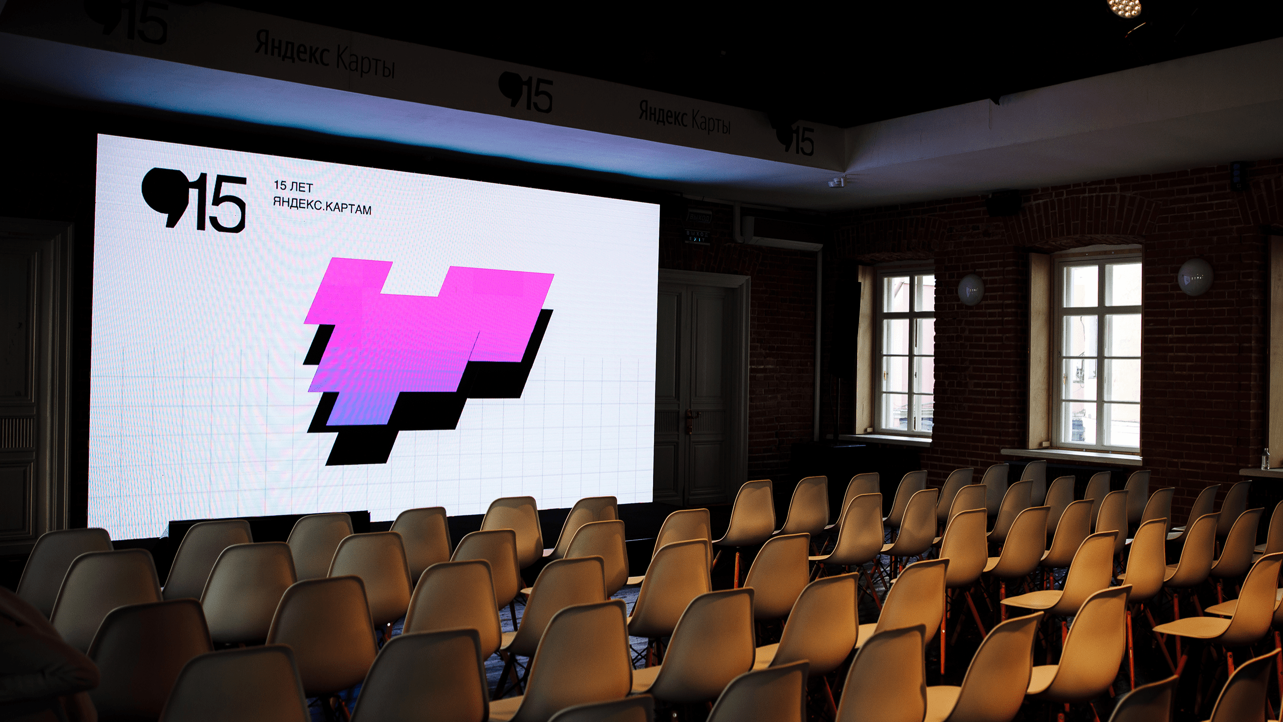

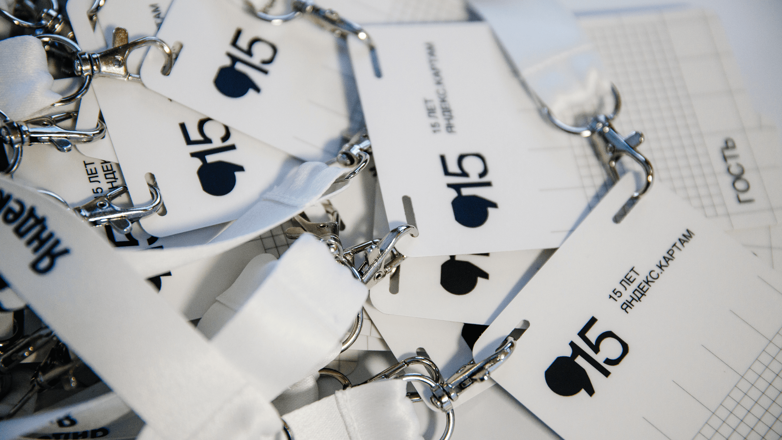
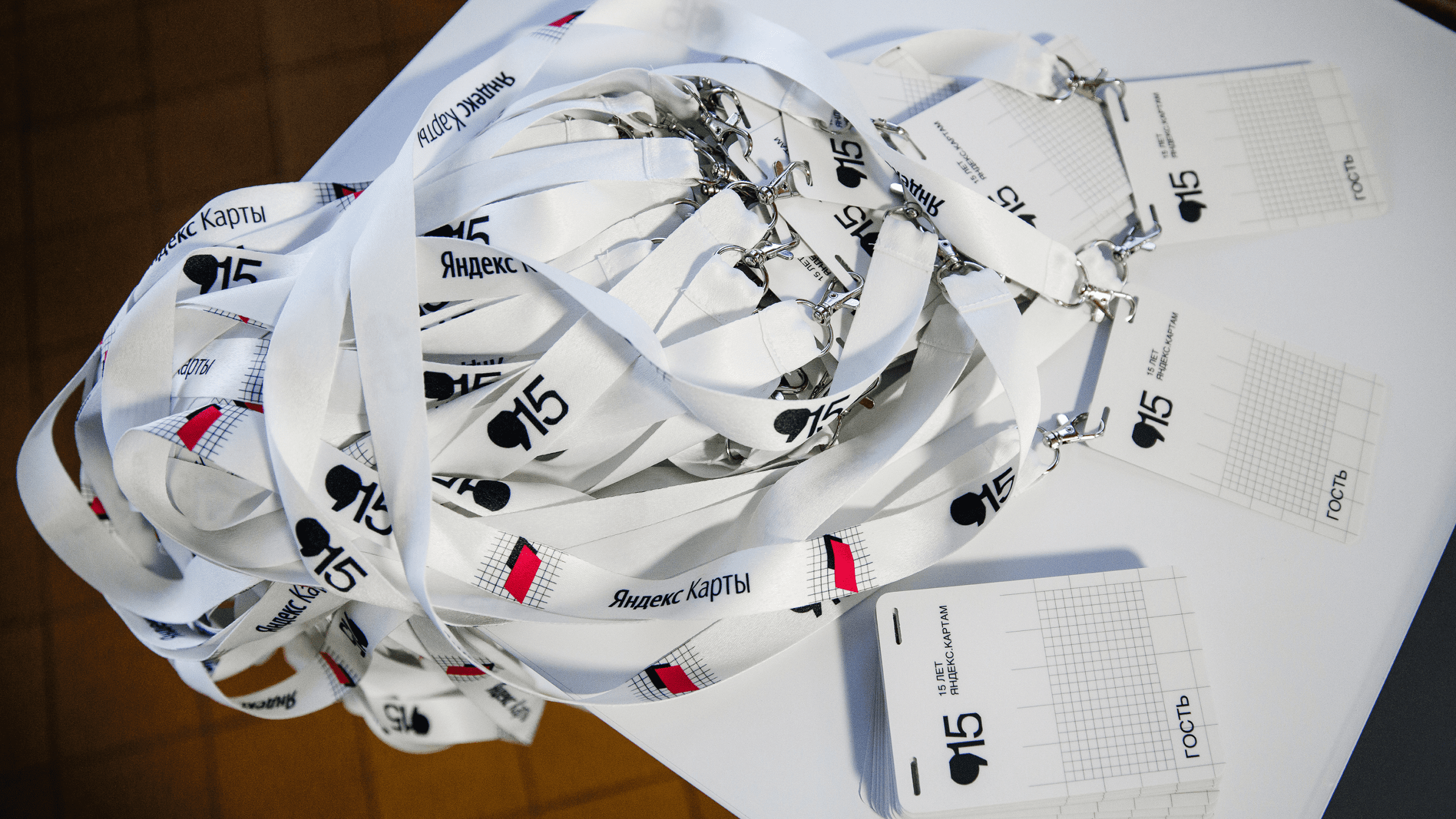
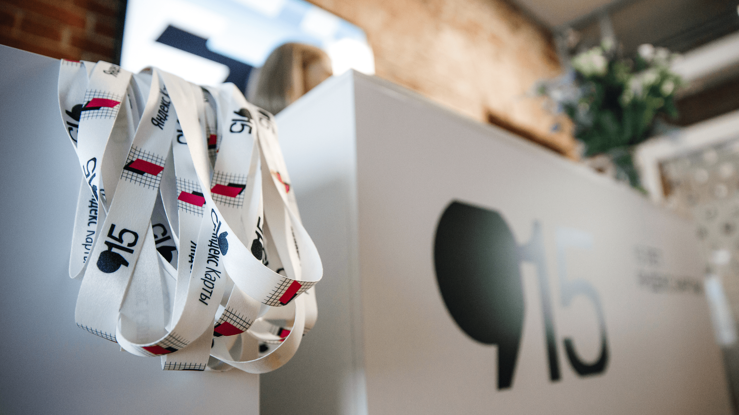
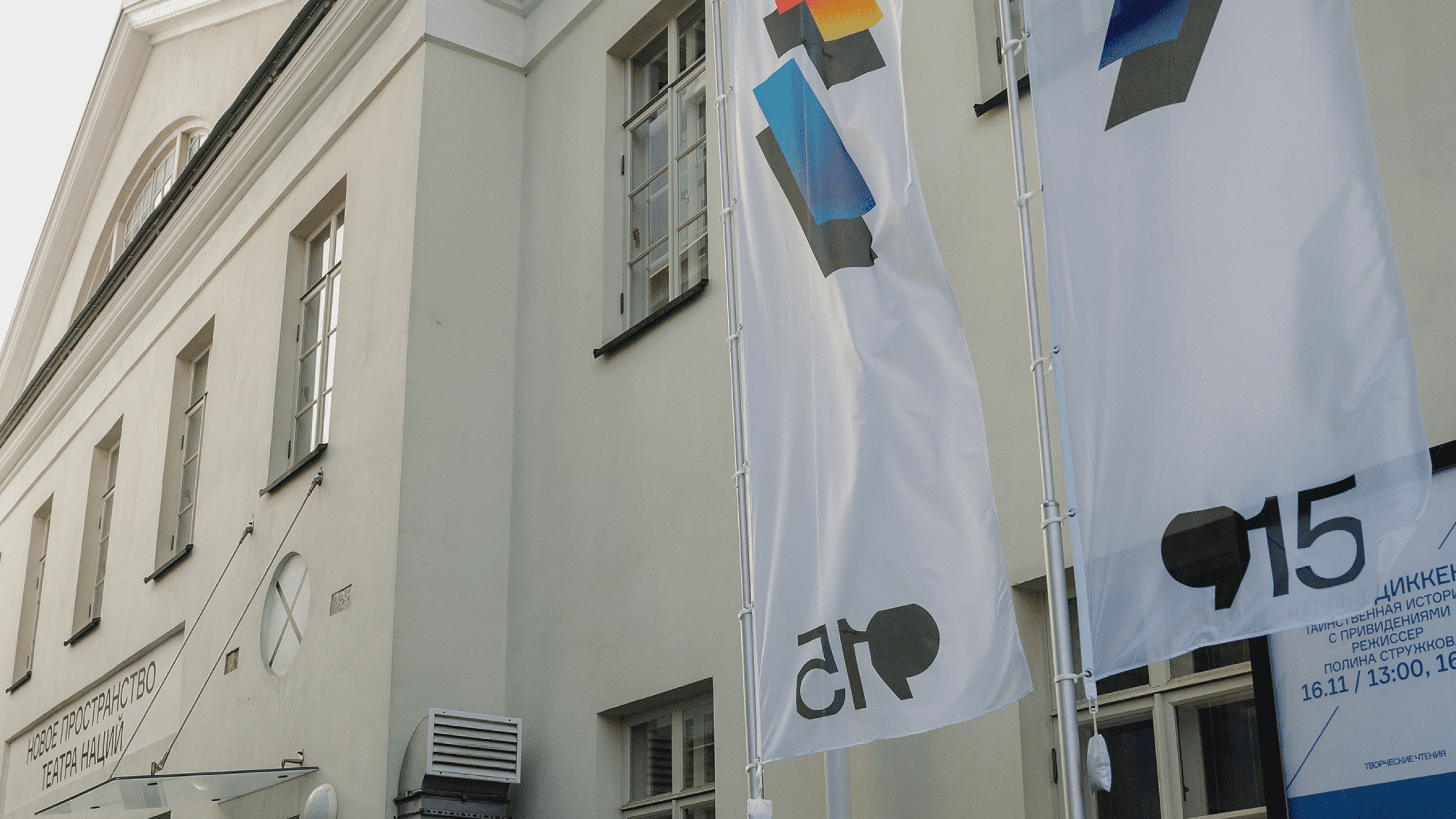
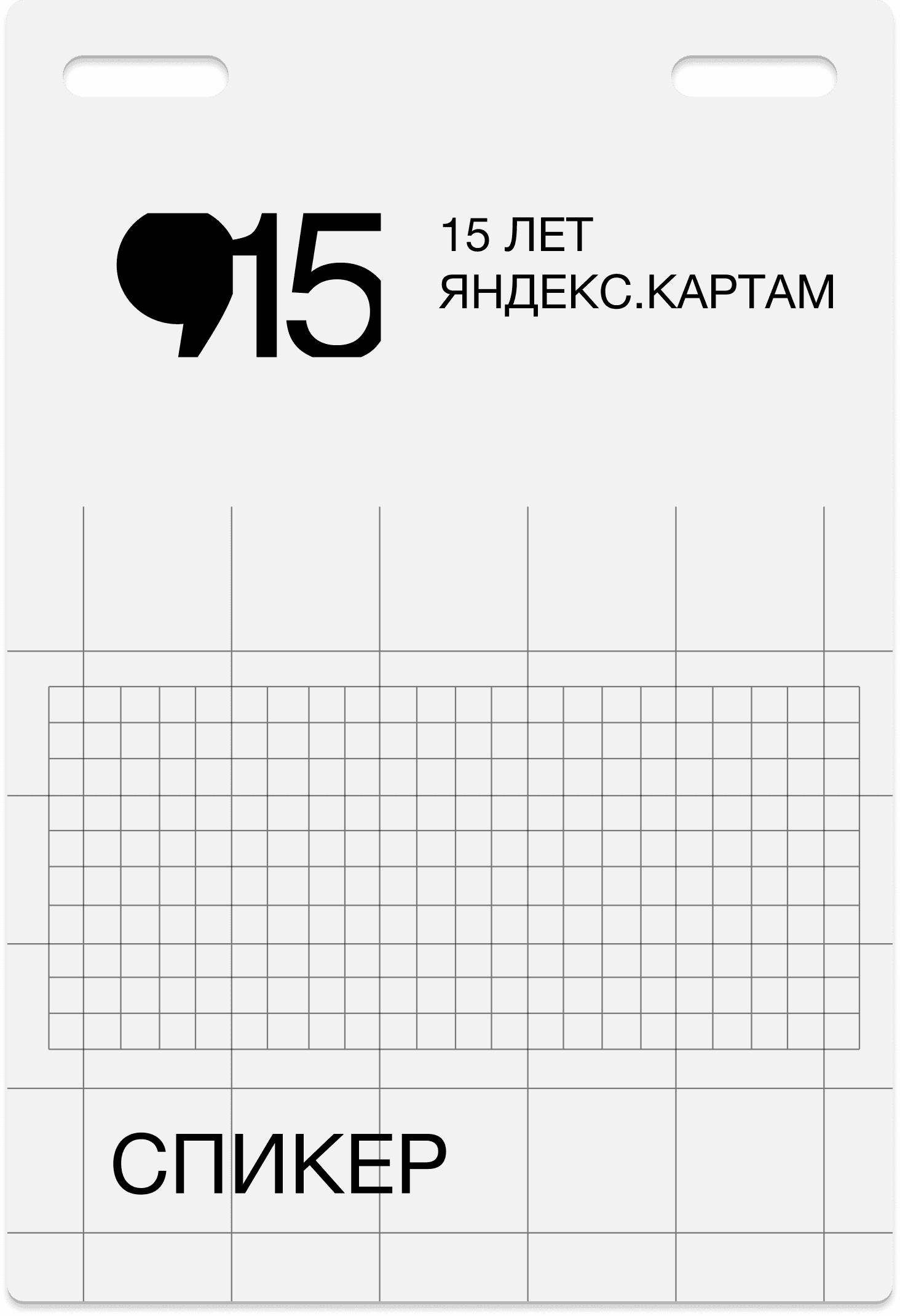


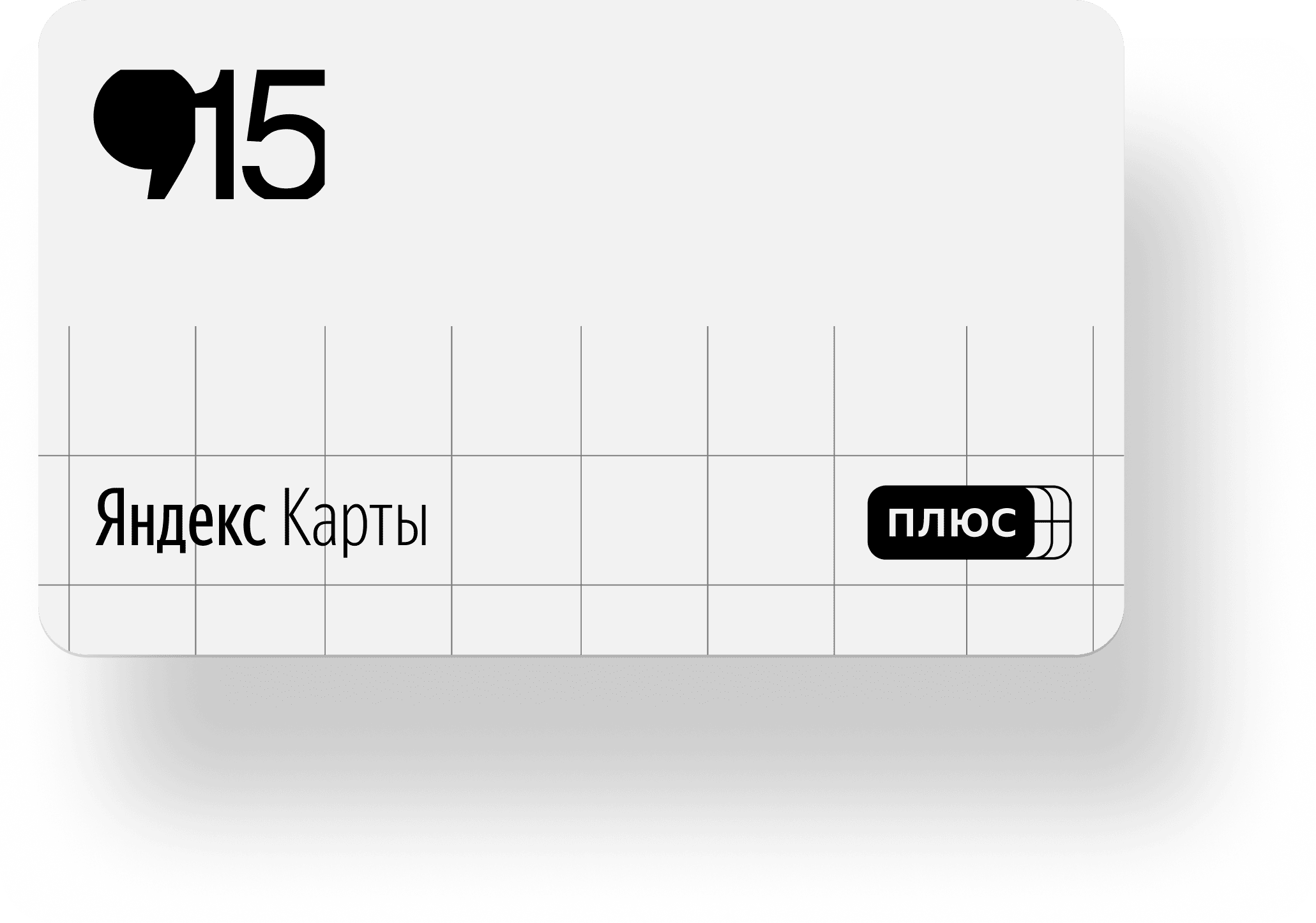
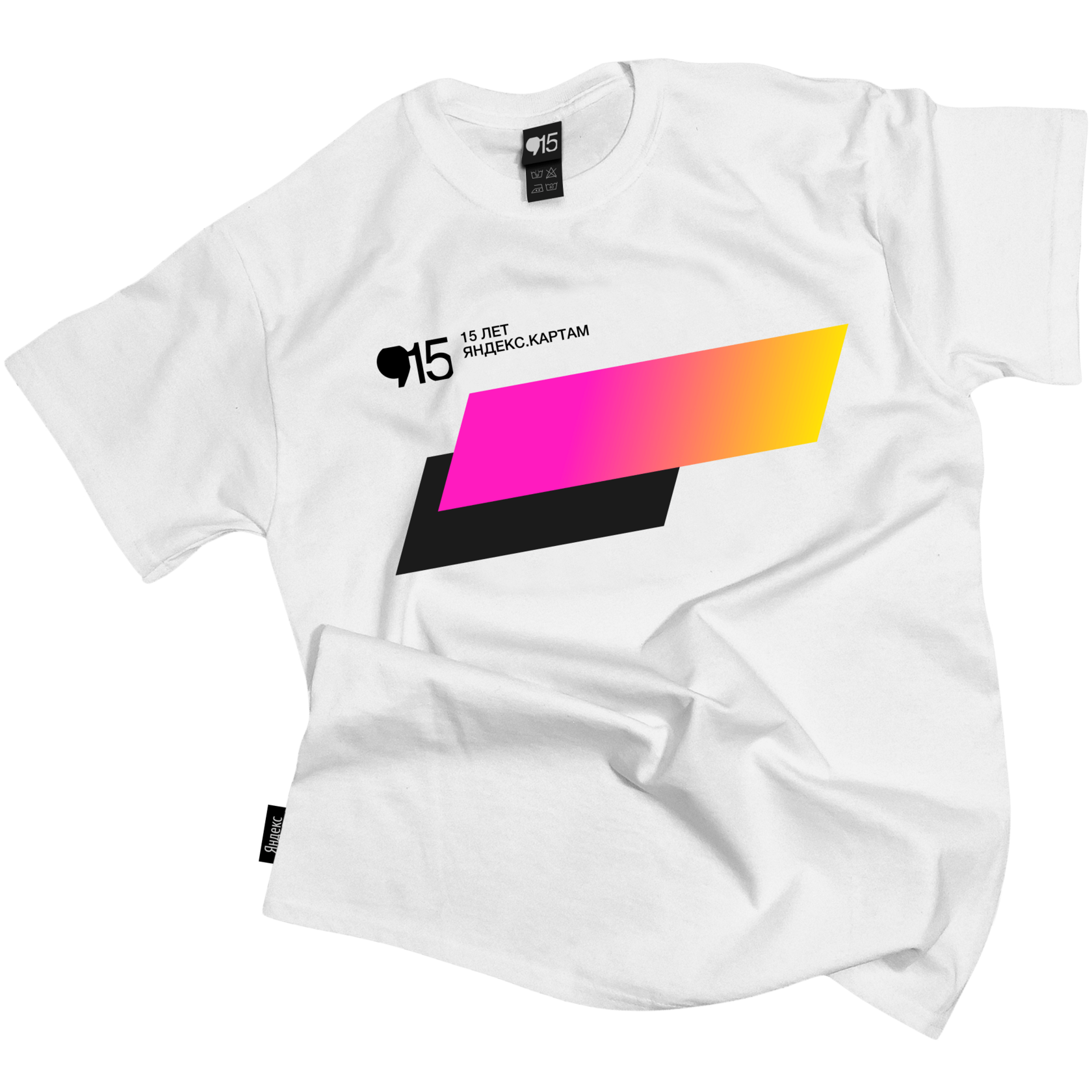
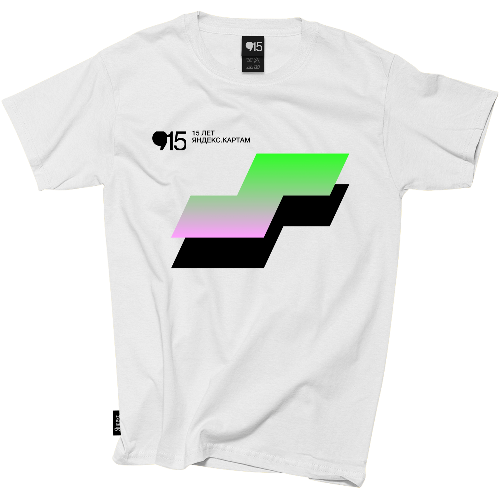

As a result, we got a design that reflected the main theme of the event: about the past (the map grid is the base), the present (the availability of Yandex Maps in all federal districts) and the future (dynamic brightly coloured figures striving forward).

As the logo of the event I took the icon of Yandex Maps ( - ) and the anniversary number 15 and enclosed them in two square modules to support the basic shape of the figures.


Highlighting each district with a single color I got abstract figures, which became the main graphic elements of the design. Having been skewed a bit and supplemented with a shadow, the figures became even more awesome


The idea of the design is to stylise the 8 federal districts of Russia in the form of rough square contours based on a cartographic grid, which can be seen in the Yandex Maps application itself when you zoom the map in and out.
Design concept
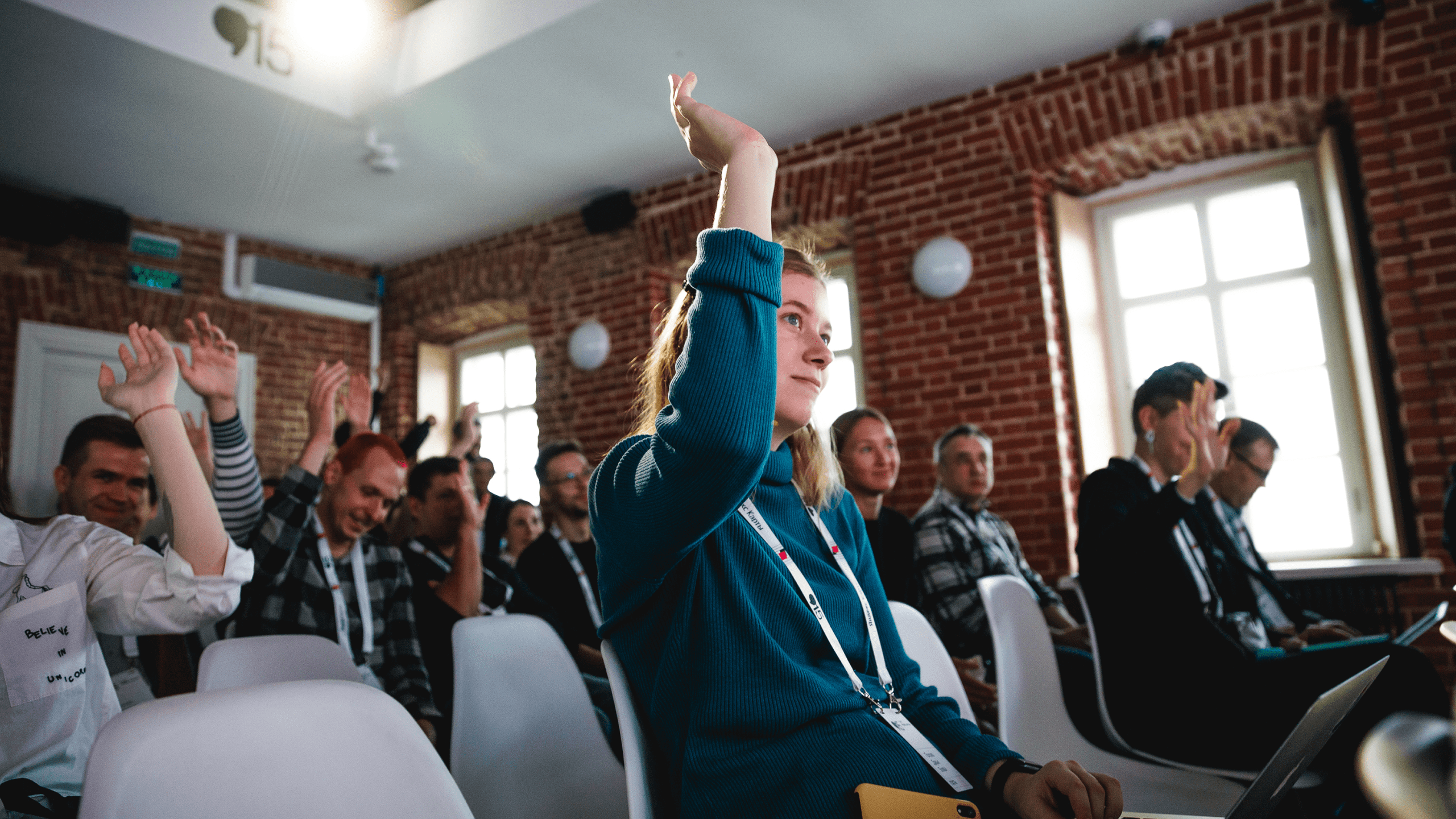
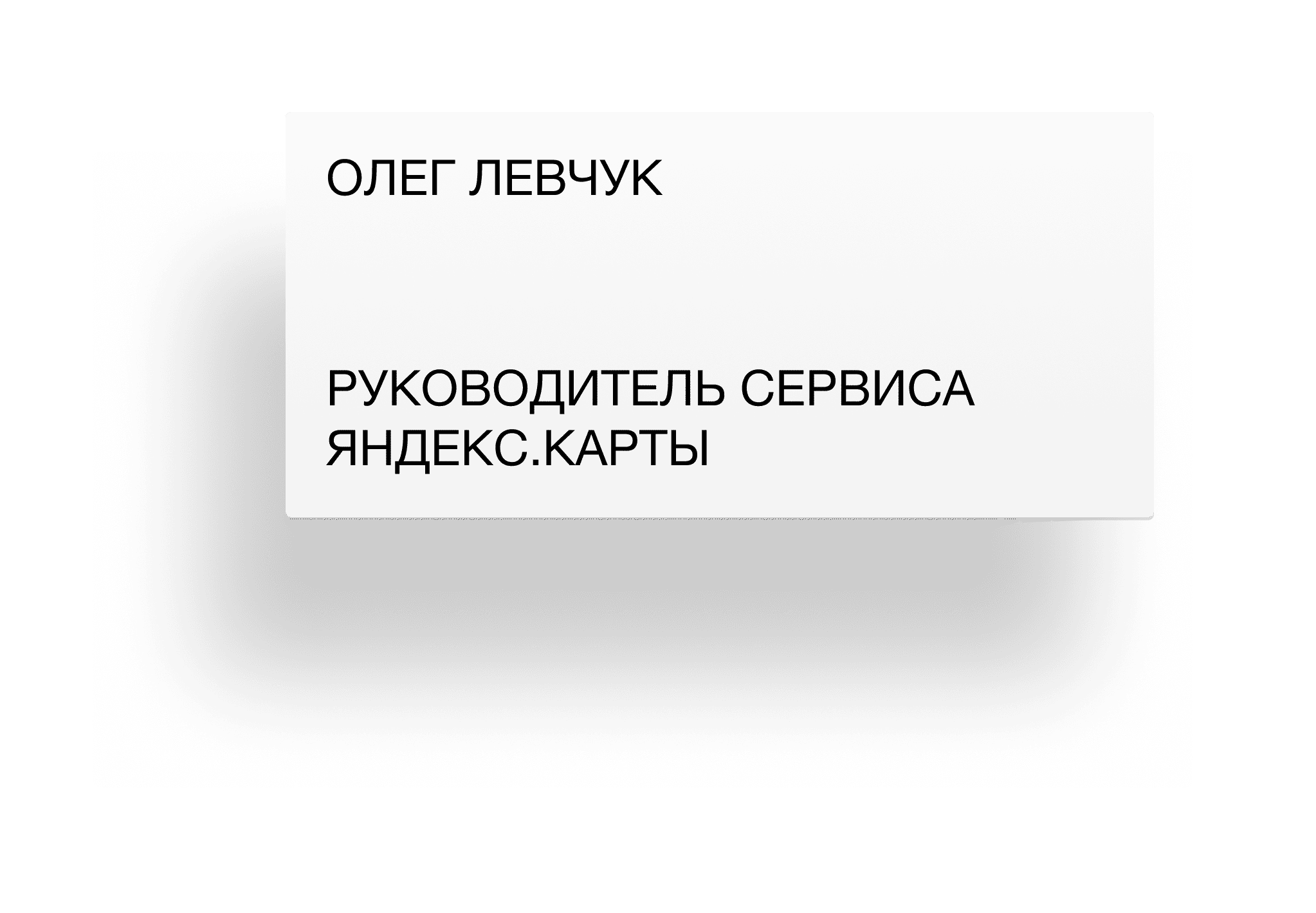
The press conference marking the 15th anniversary of Yandex Maps took place at the New Space of the Nations Theatre in Moscow. My responsibilities involved selecting the right venue, creating a design concept, and arranging all essential materials for the speakers and the production team.
2019
15th anniversary
of Yandex Maps
of Yandex Maps
Nikita Borodin™. 2025

©
